Surface
Save experience with a new component contribution to the design system
Team
1 Product Manager · 2 Engineers · 1 Designer (me)
Scope
Product Design · User Research · Prototyping
THE PROBLEM
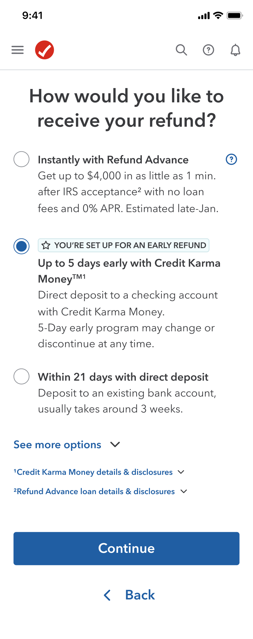
131K customers opened a Credit Karma Money account in 2023, then changed their mind
A "Heartbreaker" is a TurboTax customer who selects Credit
Karma Money to deposit their refund, then switches to a different method before
filing is complete. They didn't think getting their refund five days early was fast
enough, and weren't confident Credit Karma was a real bank. The existing save
experience only retained 11 to 27% of these customers, and for 2024 there was a
clear need to improve it.
RESULT
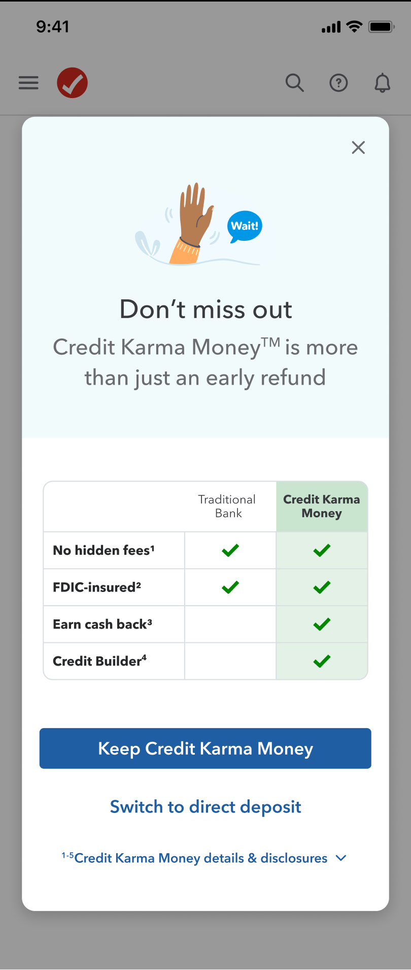
A comparison-chart modal that rebuilt trust in Credit Karma as a real bank
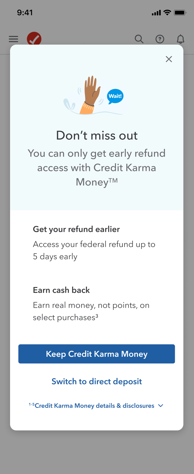
The solution: a modal that appears the moment a customer
switches away from Credit Karma Money, replacing a plain benefits list with a
comparison chart weighing Credit Karma Money against a traditional bank. It leans
on loss of "5 days early" as the primary motivator, backed by trust-building,
table-stake benefits.
01
100.2
Take Rate
Indexed take rate on the new save modal, measured May 2024.
02
$200K
Revenue Saved
Revenue saved over baseline as a direct result of the redesigned experience.
CONTEXT
A disjointed save screen that never explained why Credit Karma Money was worth keeping
Since Intuit acquired Credit Karma, TurboTax customers could
deposit their refund into a Credit Karma Money account and receive it five days
early. The existing Heartbreaker experience triggered as an entirely new screen when
a customer went back to change their refund method, adding to an already long tax
filing flow without ever highlighting what made Credit Karma Money worth keeping.
KEY DECISIONS
Three calls that shaped the experience, and why I made them
User research shaped every major call here: which interjection
point to use, how to present Credit Karma Money's benefits, and how to get an
unbuilt component shipped despite real engineering constraints.
DECISION 01
Chose a modal over a banner, after concept-testing two interjection points
I explored two ways to surface Credit Karma Money's benefits.
A banner on the refund selection screen added no extra screens, but couldn't fit
enough information to build trust. A modal, triggered right after a customer picked
a different refund method, could carry a full comparison but risked adding to an
already long flow. My team preferred the modal: it acted as a soft reminder without
inserting a brand new interjection screen the way the old design did.
DECISION 02
User-tested a benefits list against a comparison chart, and the chart won clearly
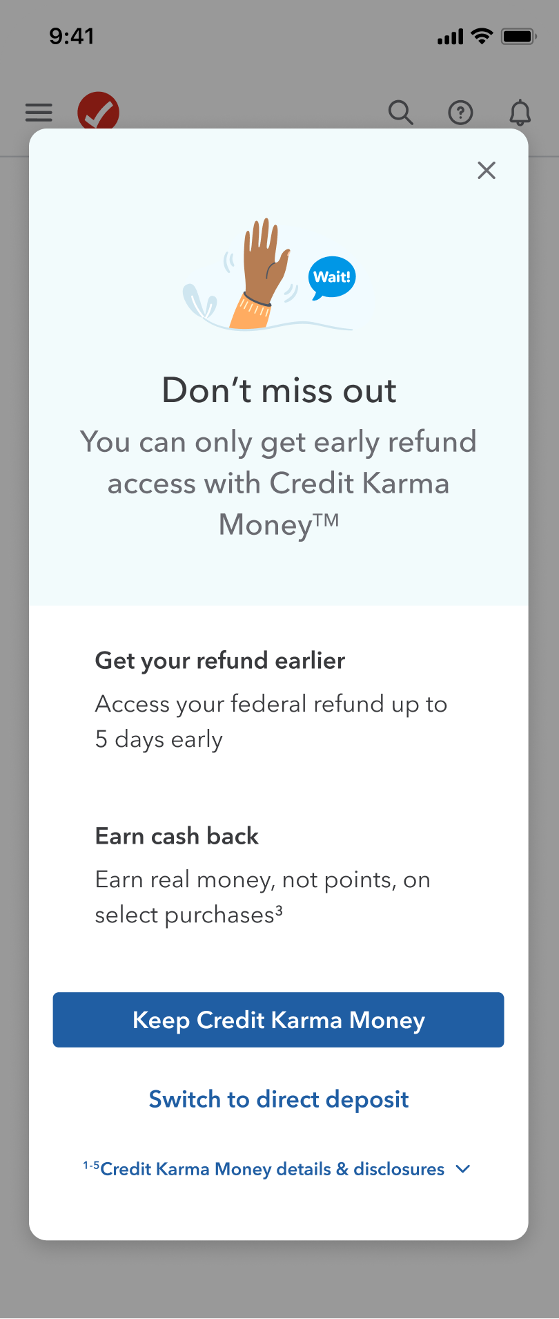
Inside the modal, I narrowed to two concepts: a short list of
Credit Karma Money's key benefits, or a chart comparing it directly to a traditional
bank. I tested both, in random order, with ten customers. The comparison chart won
decisively: the list offered too little information, while the chart let people see
Credit Karma Money's potential as a real bank, directly addressing the trust concerns
research had already surfaced.
DECISION 03
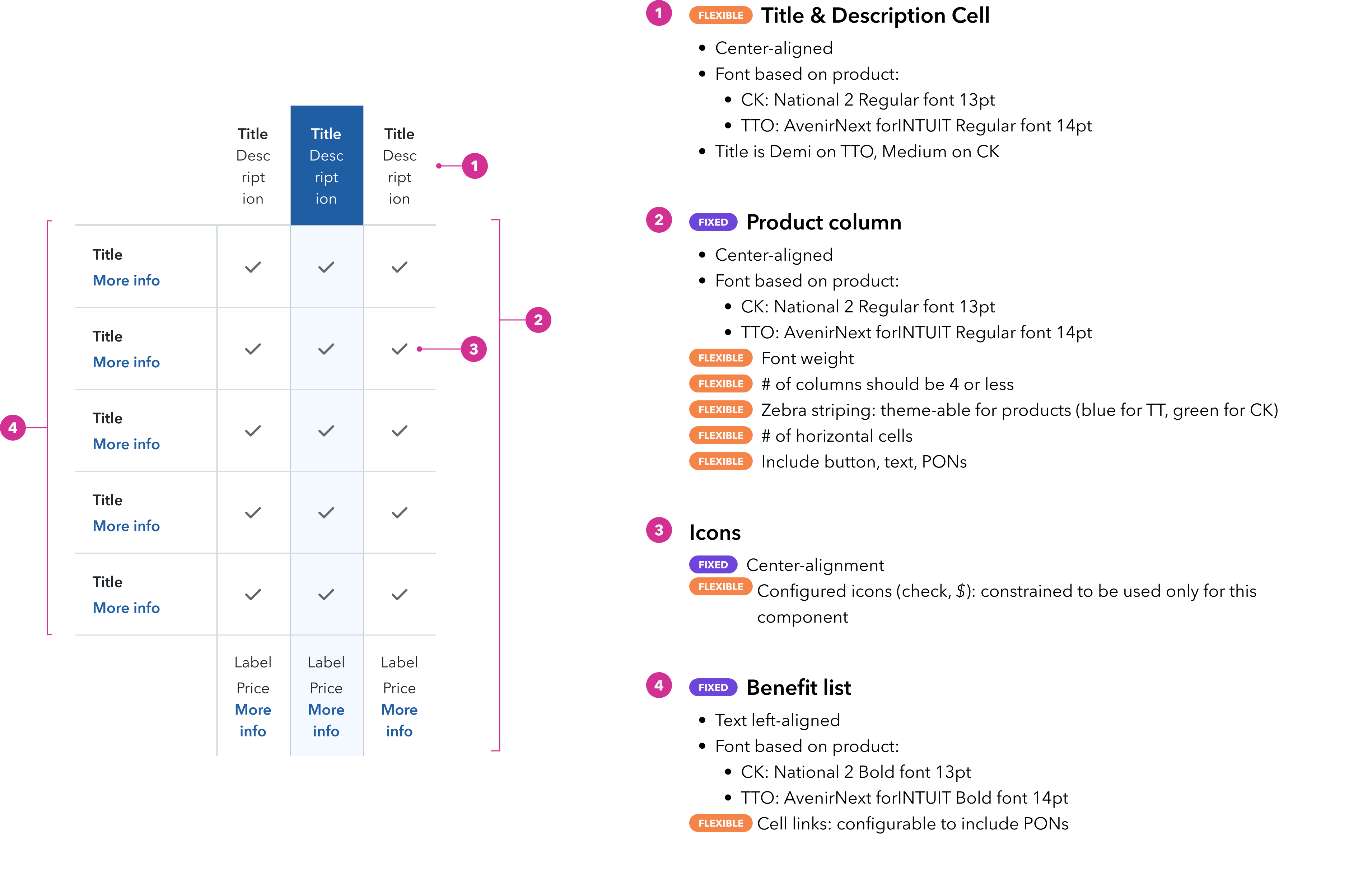
Contributed back to design systems by scaling and creating a reusable component
I cut the modal's illustration to make room for the chart,
and worked with content, legal, and research to land on trust-building benefits. The
chart itself wasn't an existing component, and a from-scratch build was ruled out as
too large a scope, so I made the case to modify an existing one instead, scaling it
to fit this use case and documenting it as a formal spec so other teams could reuse it.
contributed: comparison chart